The Article Detail element displays the full content of a Shopify blog article, including text, images, and formatting. It automatically adapts to the article being viewed, making it ideal for blog post pages and content-focused layouts.
I. Article Detail Element - Content Settings
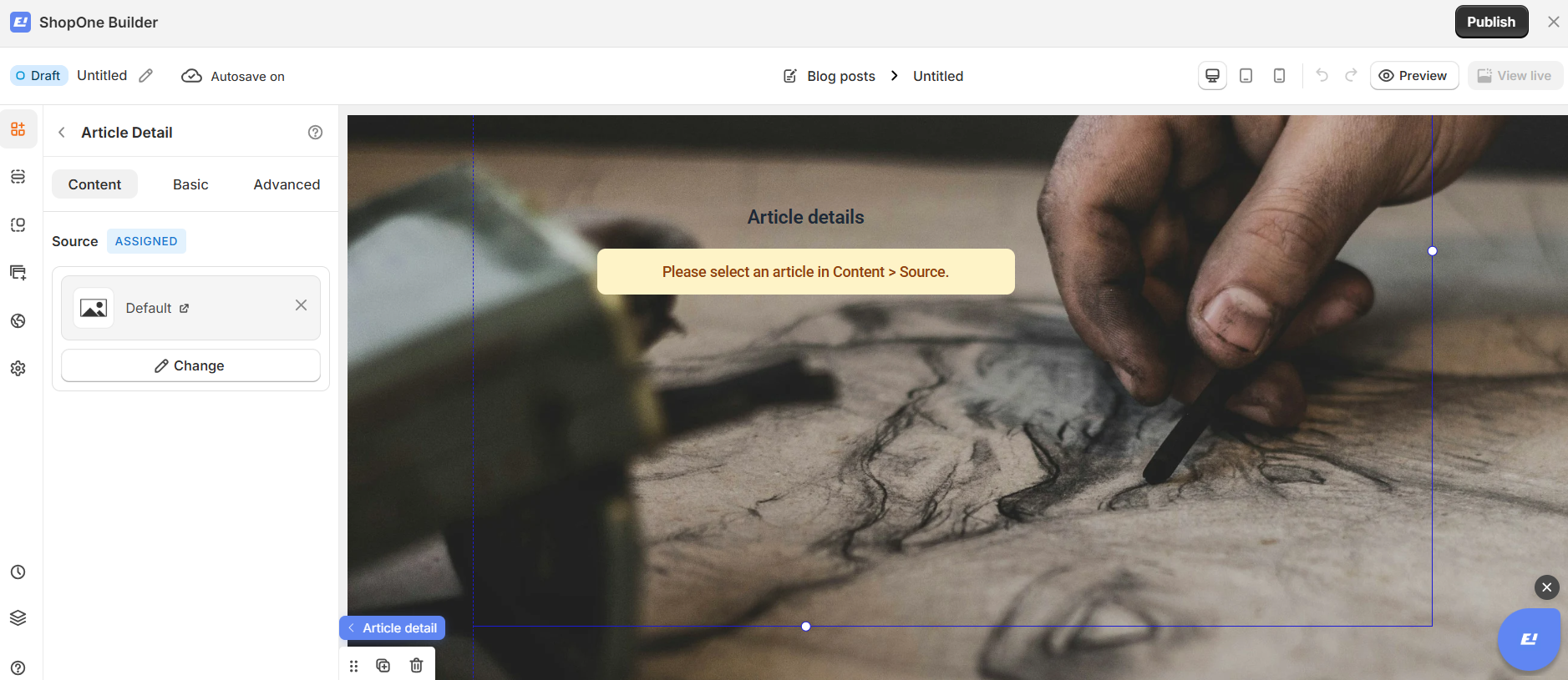
Source
The article source is Assigned by default.
This means the Article Detail element automatically pulls content from the current article context:
On an article page, it displays that article’s content
No manual selection is required on the live storefront
You can change the article in the editor for preview or design purposes without affecting the live store.
II. Article Detail Element - Basic Settings
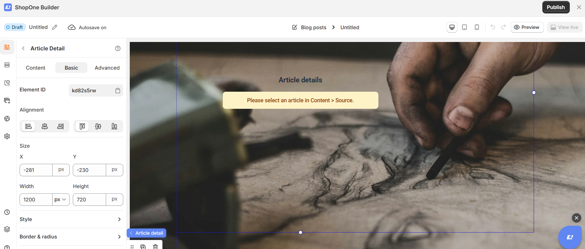
Element ID
Each Article Detail element has a unique Element ID.
You can copy this ID for advanced customization, such as custom styles or scripts.
Alignment
Control how the article content is aligned within the page:
Align left
Center
Align right
Distribute evenly
This helps structure long-form content for better readability.
Size (X & Y)
Adjust the position of the Article Detail element:
X: Horizontal position
Y: Vertical position
Values are set in pixels (px) for precise layout control.
Width & Height
Width: Define the content width (e.g. 1200px) for comfortable reading
Height: Set a fixed height or allow scrolling content as needed
This gives you full control over how article content appears on the page.
Style
Customize the visual appearance of the article content, including background and layout styles, to match your brand.
Border & Radius
Add borders or rounded corners to visually separate the article section from other page elements.
Space
Adjust inner and outer spacing to improve readability and create a clean, balanced layout.
Best Use Cases
Blog post pages
Content marketing pages
Educational articles
Storytelling sections
III. Article Detail Element – Advanced Settings
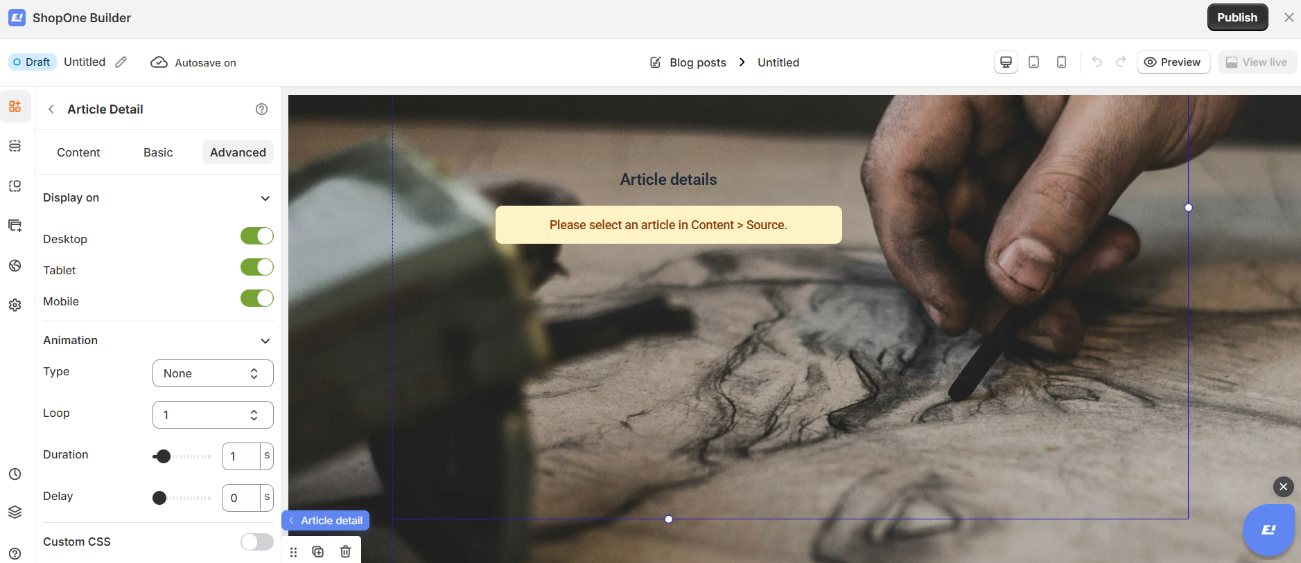
The Advanced tab allows you to control interactions, device visibility, animations, and custom styling for your text element.
Display on
Control where the text will be visible:
- Desktop – show/hide text on desktop devices.
- Mobile – show/hide text on mobile devices.
This helps you optimize the layout for different screens (responsive design).
Animation
Bring your text to life with animation effects.
- Type: Choose an animation style (e.g., fade, slide, bounce).
- Loop: Set how many times the animation repeats.
- Duration: Adjust how long the animation lasts (in seconds).
- Delay: Add a delay before the animation starts.
Custom CSS
- Turn this on to apply your own CSS code for advanced styling.
- This is especially useful for developers or advanced users who want unique effects beyond the built-in options.
=> The Advanced tab gives users more control, interactivity, and professional effects, making the text stand out and adapt perfectly to any device.
Thanks for reading! If you have any questions, please contact us via email: support@shopone.io
Was this article helpful?
That’s Great!
Thank you for your feedback
Sorry! We couldn't be helpful
Thank you for your feedback
Feedback sent
We appreciate your effort and will try to fix the article
