The Article Content element displays the main body text of a Shopify blog article. When used inside an Article Detail container, it automatically pulls the article content, keeping your blog layout dynamic and easy to manage.
I. Article Content Element - Content Settings
Automatic Article Source
This block is designed to work inside an Article Detail container.
It automatically uses the article selected in the parent Article Detail element
No manual content selection is required on the live storefront
This ensures the correct article content is always displayed.
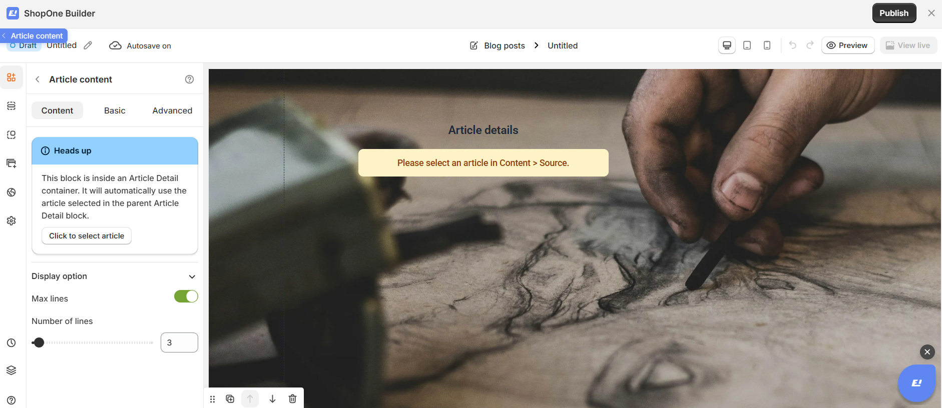
Display Option
Max Lines
Enable Max lines to limit how much article content is shown.
Number of Lines
Choose how many lines of content to display (for example, 3 lines).
This is useful for:
Article previews
Blog summaries
Content teasers on landing pages
II. Article Content Element - Basic Settings
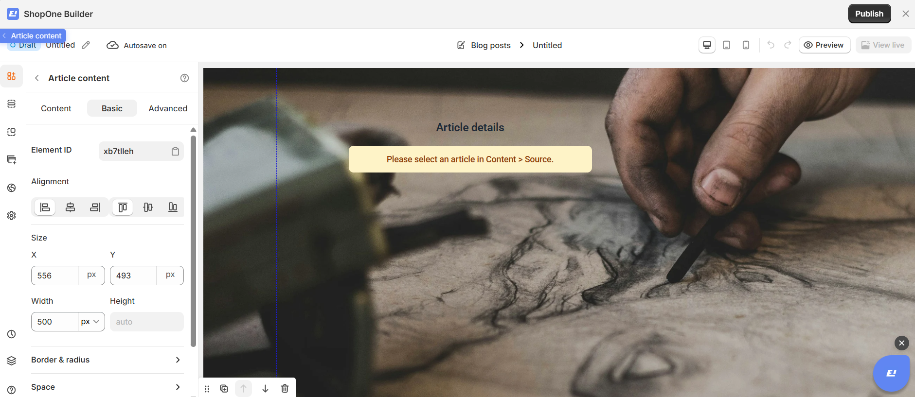
Element ID
Each Article Content element has a unique Element ID.
You can copy this ID for custom styling or advanced targeting.
Alignment
Control how the article content is aligned within its container:
Align left
Center
Align right
Distribute evenly
Proper alignment improves readability.
Size (X & Y)
Adjust the position of the content block on the page:
X: Horizontal position
Y: Vertical position
Values are set in pixels (px) for precise placement.
Width & Height
Width: Define a fixed or responsive width for better reading experience
Height: Leave as auto to adjust naturally based on content length
Border & Radius
Add borders or rounded corners to visually separate the content block if needed.
Space
Adjust inner and outer spacing to improve readability and layout balance.
Text
Customize text properties such as font size, color, line height, and font weight to match your brand.
State
Control how the content appears in different states (for example, normal or hover), useful when combined with links.
Best Use Cases
Full article pages
Article previews
Blog summaries
Content-focused landing pages
III. Article Image Element – Advanced Settings
The Advanced tab allows you to control interactions, device visibility, animations, and custom styling for your text element.
Display on
Control where the text will be visible:
- Desktop – show/hide text on desktop devices.
- Mobile – show/hide text on mobile devices.
This helps you optimize the layout for different screens (responsive design).
Animation
Bring your text to life with animation effects.
- Type: Choose an animation style (e.g., fade, slide, bounce).
- Loop: Set how many times the animation repeats.
- Duration: Adjust how long the animation lasts (in seconds).
- Delay: Add a delay before the animation starts.
Custom CSS
- Turn this on to apply your own CSS code for advanced styling.
- This is especially useful for developers or advanced users who want unique effects beyond the built-in options.
=> The Advanced tab gives users more control, interactivity, and professional effects, making the text stand out and adapt perfectly to any device.

Thanks for reading! If you have any questions, please contact us via email: support@shopone.io
Was this article helpful?
That’s Great!
Thank you for your feedback
Sorry! We couldn't be helpful
Thank you for your feedback
Feedback sent
We appreciate your effort and will try to fix the article
